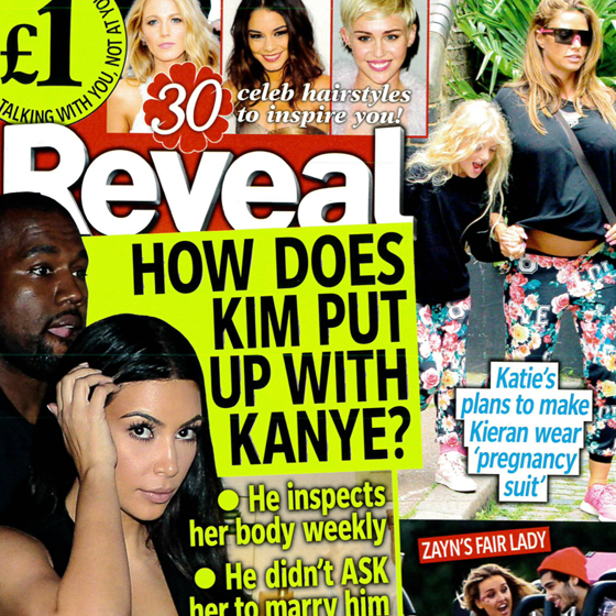
This is clear brand identity because the Industry is a mainstream company who have a wide range of audiences who look up to their shoes and consume them and this industry is famously well know in many countries E.G : UK , USA . The imperative ; This shoe works if you do " reminds you of the brand this shoe is related to . The background has a heavy use of white to give out connotations of the brand colour as the Nike tick on the shoe is white ,
 The advert uses the imperative "spot the difference " to make the viewer think outside the box . The background has a heavy use of white to create a image of the car as the colour back is recognised when you look at this car . The idea of a another door makes the reader recognise the difference and comparison between the 2 cars .
AN EMOTIONAL CONNECTION

The produce uses the word "donate " to evoke the idea of innocent deaths . This is shown by the sentence " A child dies every 3 seconds " . The denotation of the tap shows how dirty the water is , innocent poor people are drinking as the tap is rusty and would not want to be touched . The heavy use of white in the background gives you a strong memory of the brand and this may lead to you donating to other people who are less fortunate then you .
AN EMOTIONAL CONNECTION
 The advert uses many denotations such as the light to create the image of Christmas . This show by all the light on the truck and also on the London Bridge . The setting was taken at night where the lights will be more bright for the audiences to see and hopefully through this they will consume into the product . The heavy use of black on the background is a connotation that the product "COCA COLA " brightens up at dark and this creates a emotional connection to the audience .
  The advert uses the setting of Brazil to glamorize the product into the advert . The denotation of this is that the Coca Cola can will have some relations to the world cup . They use Brazil as its a very hot country and the world cup is played in the summer . What the company tries to convey is that the audience should consume in the product to get away from the humid heat . The colour scheme of green and yellow allows you to have a strong memory of the Brazilian flag . The heavy use of red on the background gives a clear brand identity of the product , " Coca Cola " .
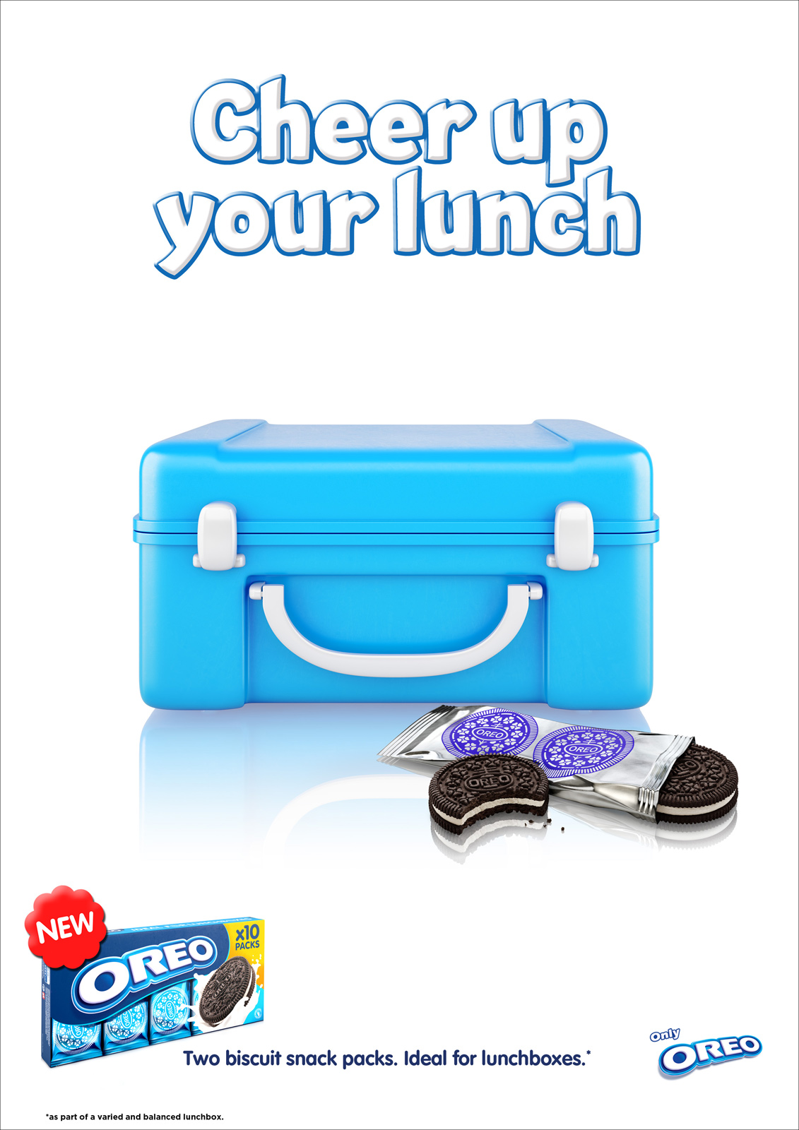 1.The connotations of this is that the Oreo gives a sense of relaxation and that you can use your Oreo to lighten up your lunch in places such as e.g , School . This is important because the producer used to convince the consumers to buy this for their kids and add this to their lunch because of its crunchy taste that kids like .